
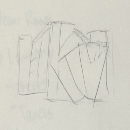
Iteration 1
I knew I wanted to have a logo which included the 3 of my intials, first, middle, and last. In this first iteration I had the K as a standout letter.
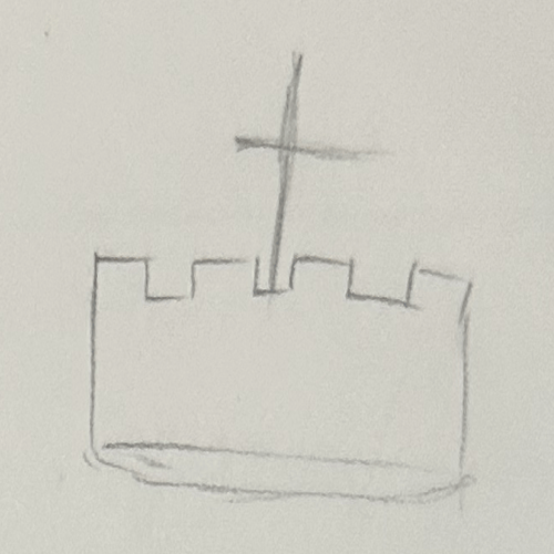
Iteration 2
I realized that my middle name (king) has huge potential for branding so I drew up a kings crown as inspiration for what it could look like.
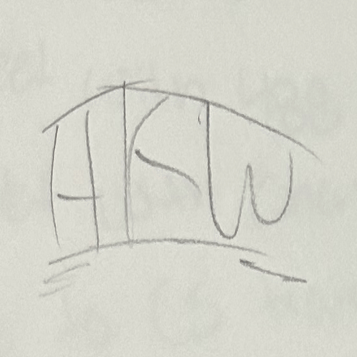
Iteration 3
I realized that a crown tends to have a curve to it and so I wanted to replicate that curve with the letters.
Iteration 4
I flushed out how the lettering looks, the spacing, and what the curve could look like.
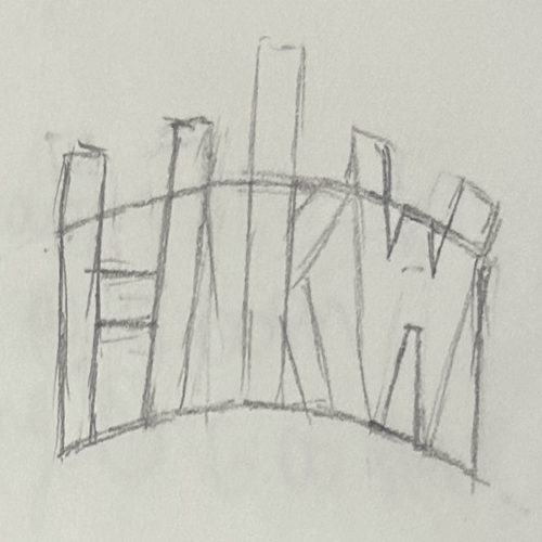
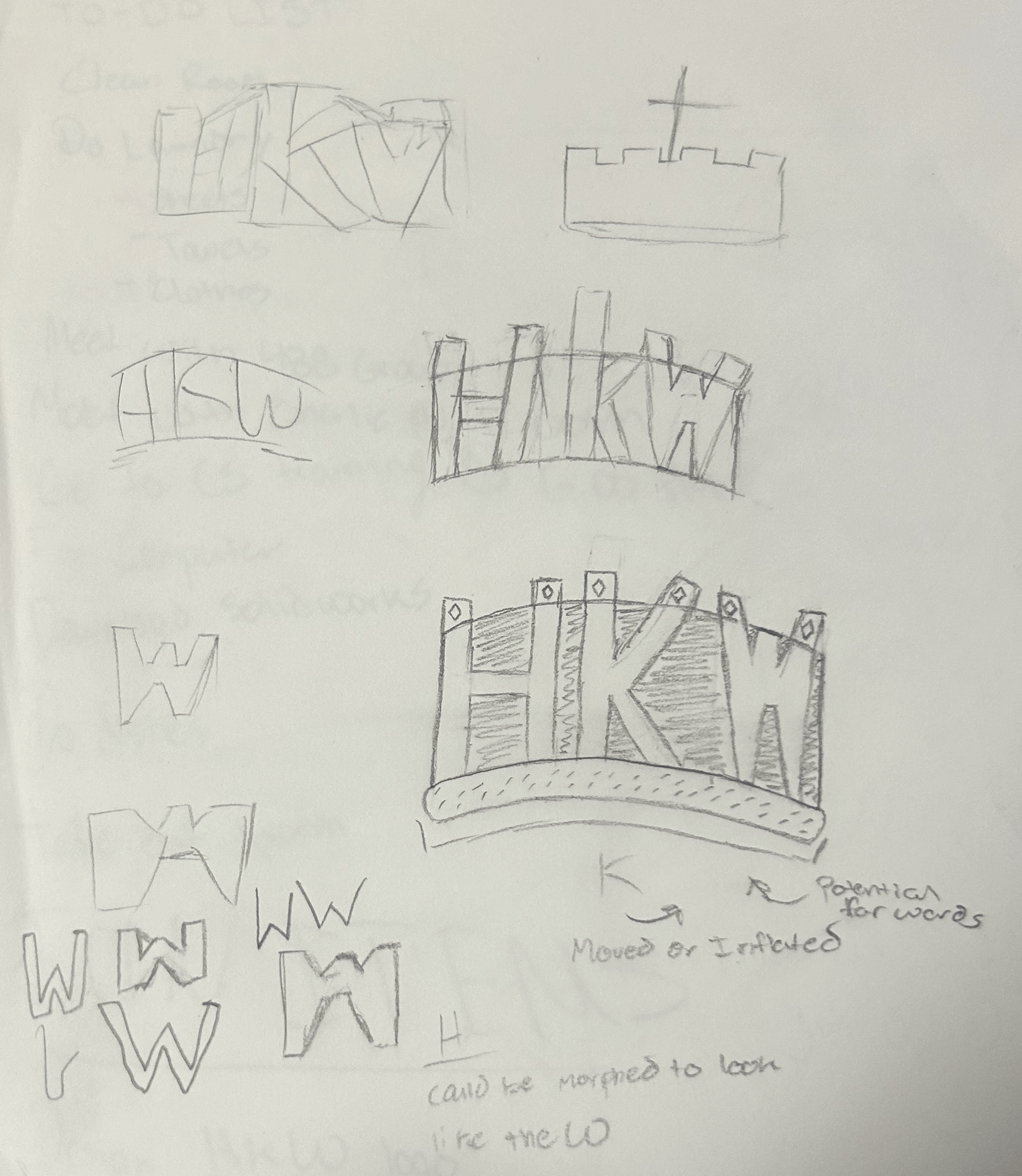
Iteration 5
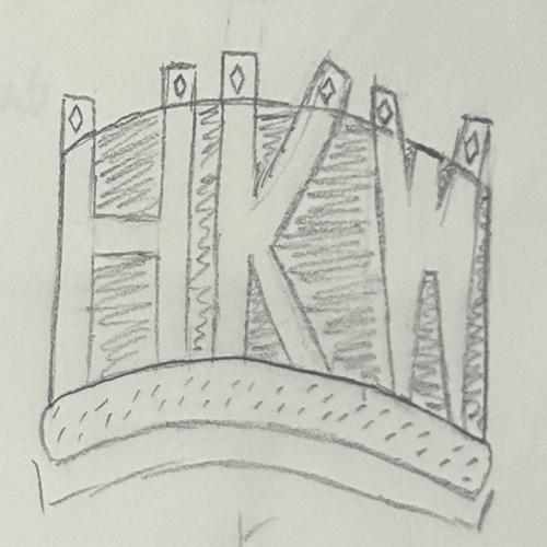
This was the final drawn iteration I did before creating the actual logo. This is heavily stylized to look like a crown with gemstones on the tops of the letters.
Font Design
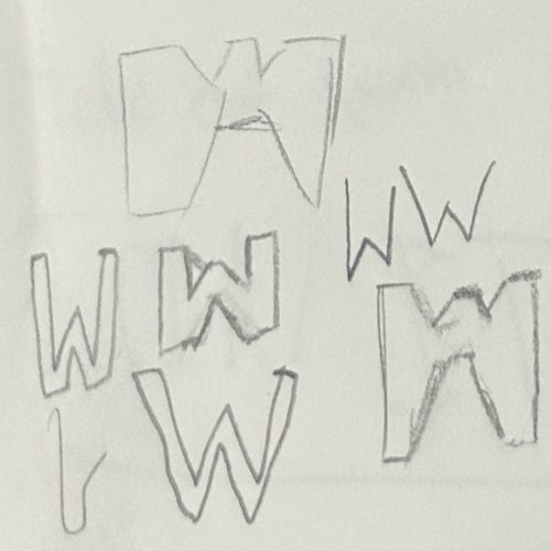
I wanted to design a 'W that would fit well with the rest of the logo. This led me in my search for a font.
First Final Design
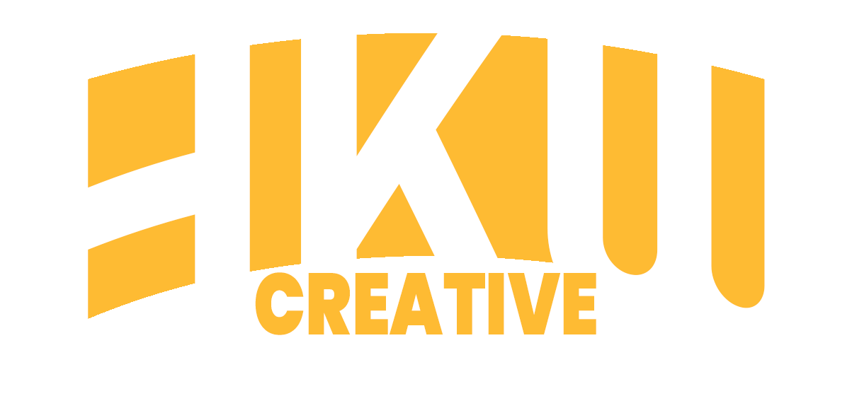
Upon finalizing the drawing, I took it into photoshop where I simplified the shape and details to fit better with a professional looking logo. I chose Righteous as the 'HKW' font and Poppins as the 'Creative' font. I made the HKW curve over like the shape of a crown, and then Creative be static at the bottom in a white circle-ish box like the bottom or the opening of the crown. I chose the color yellow to be representative of the color of a crown while also representing USC the university I attend.
Second Final Design
While looking at the first design, I noticed a glaring design oversight: the color yellow mixed with the color white was too difficult to look at and would not be smart branding wise. There was not enough contrast and I felt the message of the logo got lost in the colors. I decided to instead change it to my personal favorite color (blue) and have landed with this logo which is much more visually pleasing to look at and works better together overall across my website and social media pages.
Social Media Logo
Upon finalizing my logo design, I realized that I needed a smaller icon that I could use as a profile picture across social media and my website. The current logo was way too long to fit nicely in a 500x500 space so I designed the smaller version on the left. I knew I wanted to keep the curve of the HKW as it is integral to the design and branding so I kept the curve of the letters, and place the 'Creative' below mainting color seperation and recognizability even when it is a smaller icon.